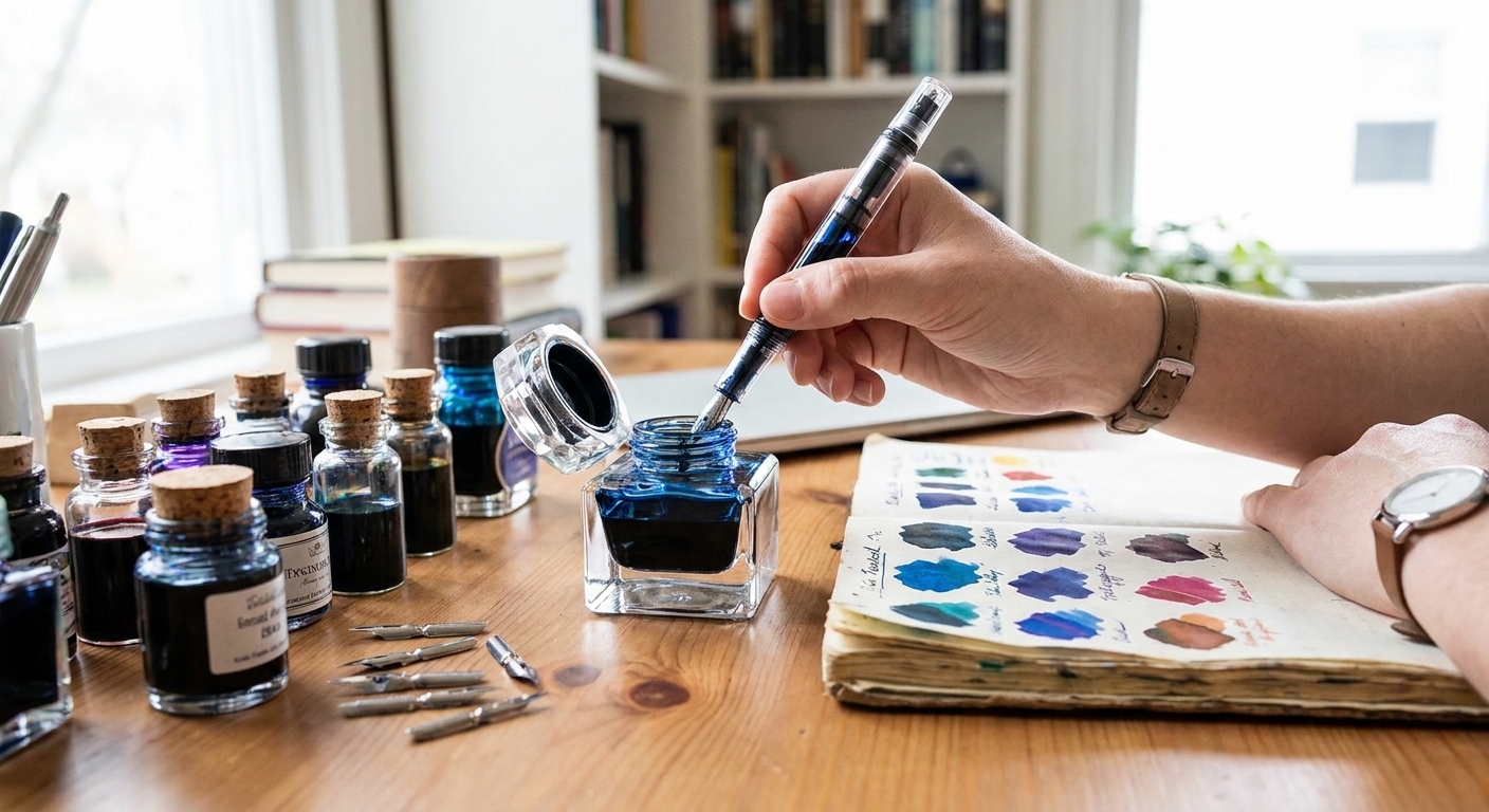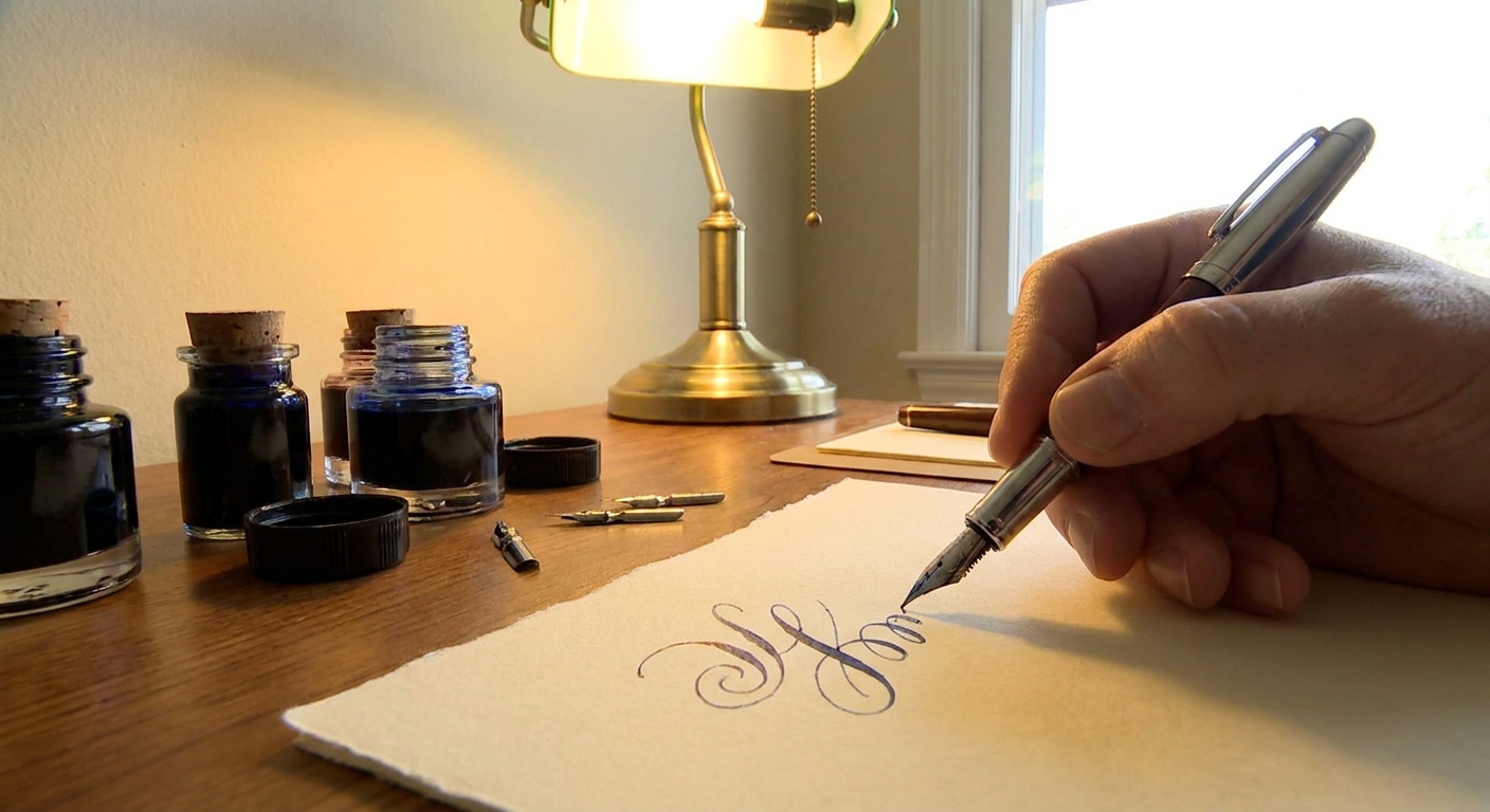
There is a particular moment when a fountain pen first meets paper: the slight give of the nib, the breath of ink blooming into the fibers, the faint whisper of a line being born. For many of us, this is not nostalgia—it is nourishment. A fountain pen turns notes into keepsakes and signatures into small rituals.
The Quiet Luxury of a Fountain Pen
This guide is a tour through that experience, from the nib’s geometry to the paper beneath your hand, with practical advice at every step.
Understanding Nibs: The Character of Your Line
A fountain pen’s heart is its nib. Everything you feel on the page—crisp or cushioned, wet or controlled—begins at this tiny piece of metal.
Nib Materials
- Steel nibs
Modern steel nibs are durable, consistent, and far better than their reputation suggests. They offer a dependable writing experience with minimal fuss and are ideal for everyday workhorses.
- Gold nibs (usually 14k or 18k)
Gold adds elasticity. It doesn’t automatically mean softness, but it can introduce more subtle feedback and a sensation of "give" as you write. Many writers find gold nibs feel more organic and responsive, especially in finer sizes.
- Exotics (titanium, specialty alloys)
Titanium nibs often feel springy and playful, sitting between steel and gold in stiffness. They can impart a slightly bouncy line that enthusiasts find addictive.
Nib Sizes and Personalities
- Extra Fine (EF) – Precise, controlled, excellent for small handwriting and marginalia. Shows less ink shading and sheen.
- Fine (F) – A versatile everyday line; compatible with most papers, even office copy stock.
- Medium (M) – A rounded, expressive line that lets inks show off their shading and sheen.
- Broad (B) and Double Broad (BB) – Generous ink flow, dramatic shading and sheen, ideal for journaling and signatures.
- Stub and Italic – Flat-edged nibs that produce line variation: thin upstrokes, broader cross-strokes. They bring calligraphic character to ordinary handwriting.
If you love smoothness, a rounded medium or broad is a safe bet. If you need practicality on cheaper paper, a fine steel nib will keep feathering in check.
Ink: Color, Flow, Sheen, and Shading
Ink is where your fountain pen becomes uniquely yours. The same nib can feel utterly different depending on what you feed it.
Flow and Lubrication
- Dry inks (e.g., some iron gall or document inks) keep lines crisp, behave well on cheap paper, and resist smudging. They can tame a very wet pen.
- Wet inks feel smooth and velvety, ideal for pens that run a bit dry or for broad and stub nibs. They can, however, cause feathering on low-quality paper.
- Wet pen + wet ink = luxurious glide, but potentially messy on poor paper.
- Dry pen + dry ink = controlled and precise, but may feel scratchy.
- Wet pen + dry ink or dry pen + wet ink = balanced, often delightful.
Matching ink to pen is part of the craft:
Sheen, Shading, and Shimmer
- Shading – The same line shows lighter and darker areas as ink pools and thins. Nibs with broader tips and wetter flow showcase this best.
- Sheen – A secondary reflective color visible at certain angles (e.g., a blue ink with red sheen). High-sheen inks love dense, coated papers.
- Shimmer – Suspended particles create a sparkle. They require more frequent cleaning and wider nibs to avoid clogging.
If you’re just starting, look for an ink known for good behavior—low feathering, quick enough dry times, and modest shading. Once you know your pen’s temperament, explore sheening and shimmering inks on higher-quality papers.
Paper: The Silent Partner
The wrong paper can sabotage even the finest pen. The right paper makes the line sing.
Key Paper Qualities
- Sizing and coating – Controls how quickly ink soaks in. Well-sized papers prevent feathering and allow shading and sheen to develop.
- Weight (GSM) – Thicker paper (80–100+ gsm) is less likely to show bleedthrough, though composition matters as much as weight.
- Surface texture – Smooth paper offers a glassy glide; lightly textured paper introduces a pleasant pencil-like feedback.
Reliable Fountain Pen Papers
- Rhodia / Clairefontaine – Smooth, consistent, excellent for sheening inks.
- Tomoe River (old and new) – Legendary for sheen, though thin and crinkly. Ghosting is common but bleedthrough is rare.
- Midori MD, Cosmo Air Light, and similar Japanese papers – Offer distinct personalities: from velvety feedback to ink-dramatizing surfaces.
For daily work, test your usual notebook or printer paper with a fine nib and a moderate ink. If you see feathering or bleedthrough, move toward better-quality notebooks rather than sacrificing the pen experience.
Maintenance: Keeping the Music in Tune
A fountain pen is a small instrument. It rewards regular care.
Routine Cleaning
- Flush every 4–8 weeks for regularly used pens.
- Use cool water in a bulb syringe or converter until water runs clear.
- For stubborn inks, a solution of water + a drop of unscented dish soap, followed by thorough rinsing, usually suffices.
Avoid harsh chemicals and alcohol. They can damage feeds, seals, and finishes.
Basic Tuning at Home
- If a nib feels scratchy, examine it under magnification. Often, tine misalignment is the culprit. Very gently adjust until both tines are level.
- If the pen is too dry, try:
- Thorough cleaning (old ink crust can restrict flow).
- A slightly wetter ink.
- Very modestly spreading the tines (only if you know what you’re doing; otherwise, seek a nib specialist).
If you’re unsure, consider a professional nibmeister. A well-tuned nib is transformative.
Choosing a Fountain Pen: Guidance Across Budgets
There is joy to be found at every price point. The best pen is the one you reach for instinctively.
Under $30: Confident First Steps
- Entry-level steel-nib pens (e.g., Pilot Metropolitan, Platinum Preppy/Prefounte, TWSBI Eco, Lamy Safari) offer reliable performance and easy maintenance.
- Look for:
- Cartridge/converter compatibility
- Simple construction and easily sourced replacement nibs
Pair one of these with a well-behaved blue-black or dark teal ink and a Rhodia pad, and you already have a refined writing experience.
$30–$150: Character and Refinement
In this range, you begin to see:
- More varied nib options (stub, soft fine, architect from specialty tuners).
- Distinctive design languages and materials—demonstrators, acrylics, ebonite.
- Upgraded filling systems: pistons, vac fillers, and large converters.
- Comfort – Section shape, weight distribution, posting behavior.
- Nib personality – Do you want glassy smoothness or a touch of feedback?
- Use case – A robust clip and snap cap for everyday carry, or a desk pen that lives in a stand.
Choose based on:
$150 and Beyond: Craft and Personal Fit
Higher-priced pens introduce:
- Gold and specialty nibs, often tuned more carefully.
- Hand-turned bodies, urushi lacquer, celluloid, and artisanal finishes.
- Customizable nib grinds and tailored flow.
- Does the pen disappear in your hand during long writing sessions?
- Does the nib’s character match what you write—journal, letters, marginalia, or drawing?
Here, fit matters more than specs:
Don’t chase prestige logos alone. Seek pens that genuinely encourage you to write more.
Building a Thoughtful Small Collection
A satisfying mini-collection can be as simple as three pens:
The Everyday Writer
- Fine or medium steel nib, moderate flow, conservative ink. - Purpose: meeting notes, quick jottings, portable reliability.
The Pleasure Pen
- Broad or stub nib with a wet, shading or sheening ink. - Purpose: journaling, letters, slow and deliberate writing.
The Explorer
- Something unusual: a soft nib, titanium, vintage flex, or a custom grind. - Purpose: rediscovering your handwriting, sketching, ink sampling.
Rotate each through different inks and papers. Notice how your preferences evolve—this is part of the joy.
Celebrating the Act of Writing
A fountain pen will not make your handwriting perfect, nor should it. Instead, it reveals the cadence of your thoughts. The subtle resistance of the nib invites you to slow down just enough to inhabit each word.
Choose a pen that feels good in your fingers, an ink whose color you look forward to seeing, and paper that welcomes the line. Maintain them with a bit of care. In return, they will turn your most ordinary lists and notes into something quietly, enduringly, yours.