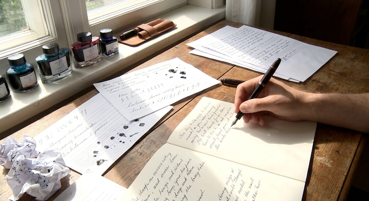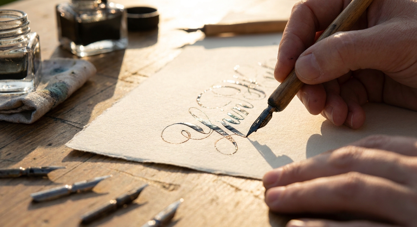
For fountain pen and stationery lovers, calligraphy is less a craft and more a conversation between hand, tool, and page. It is the moment when nib, ink, and paper align so perfectly that each stroke feels inevitable—softly guided rather than forced.
Rediscovering the Gesture of the Written Line
This is an exploration of calligraphy not as dusty formality, but as sensual alchemy: how nib geometry, ink chemistry, and paper fibers collaborate to turn handwriting into something luminous.
Choosing the Right Pen: The Spine of Your Script
Calligraphy begins long before ink touches paper. It starts with understanding how different pens translate motion into line.
1. Traditional Dip Pens vs. Fountain Pens
Dip pens
- Strengths: Extreme line variation, easy nib swapping, wide range of specialty nibs (flex, broad edge, ruling pens).
- Challenges: Frequent re-dipping, more mess, steeper learning curve.
- Best for: Dedicated practice sessions, pointed pen scripts (Copperplate, Spencerian) and classic broad-edge hands (Uncial, Blackletter, Italic).
- Strengths: Self-contained ink reservoir, portability, comfort for longer sessions, easier daily practice.
- Challenges: Less extreme flex (with exceptions), nib changes are more involved, sensitive to ink choice.
- Best for: Everyday calligraphic handwriting, modern calligraphy, italics, and expressive journaling.
Fountain pens
2. Nib Characteristics That Matter
Broad / stub nibs
- Shape: Flat or slightly rounded edge.
- Effect: Thick downstrokes, thin horizontal strokes; ideal for Italic, Foundational, and everyday calligraphic handwriting.
- Look for: Crisp edges for dramatic contrast; slightly rounded stubs for smoother, more forgiving writing.
- Shape: Sharper, more squared-off than stubs.
- Effect: Very high line variation and definition; less tolerant of rotation and angle shifts.
- Ideal for: Formal work, headers, envelopes, and titles.
- Shape: Pointed, with tines designed to spread under pressure.
- Effect: Hairline upstrokes, swelling downstrokes; perfect for Copperplate, Spencerian, and modern script.
- Note: True flex is rare in modern fountain pens; many are “soft” rather than genuinely flexible.
- Fine/EF: Subtle line variation; can still be used for delicate monoline scripts or annotations around larger calligraphic text.
- Architect: Reverse stub—thin verticals, broad horizontals. Excellent for contemporary capitals and headings.
- Entry (under $50): Pilot Parallel (broad edge), Lamy Safari with 1.1/1.5 nib, Platinum Preppy with italics ground by a nibmeister.
- Mid-range ($50–$200): TWSBI Eco/580 with stub nib, Pelikan M200 italic, vintage Esterbrook with calligraphy nibs.
- Indulgence ($200+): Custom-ground italic or architect nibs, gold flex nibs, or handmade dip nib holders with specialty nibs.
Italic nibs
Flex nibs
Fine, extra-fine, and architect nibs
Budget guidance
Ink: The Personality in Your Script
Ink is the voice of your lines: its flow decides rhythm, its saturation and sheen dictate mood.
1. Flow and Lubrication
For calligraphy, consistency of flow often matters more than outright wetness.
- Dry inks: Offer control and crisp lines but can feel scratchy on finer papers.
- Wet inks: Smoother and more saturated, but risk feathering and slower dry times.
- Balanced inks: Moderate wetness with reliable behavior across papers—ideal for practice.
- Too dry: Try a slightly wetter ink (many Japanese inks, some premium European brands).
- Too wet: Choose drier formulations or use ink with lower lubrication.
If your pen is:
2. Sheen, Shading, and Shimmer
Sheen
- Metallic or dark halo visible when ink pools (often red or gold on blue/green inks).
- Beautiful for titles, envelopes, and showpieces.
- Demands: Non-absorbent paper, broader/wetter nibs, patience with dry times.
- Lighter and darker areas within a stroke.
- Works particularly well with italic scripts and medium-broad nibs.
- Displays best on smooth, fountain-pen-friendly paper.
- Particles suspended in ink that sparkle when dry.
- Best used sparingly in dedicated pens; flush thoroughly to avoid clogs.
Shading
Shimmer
3. Practical Ink Tips for Calligraphers
- For serious practice: Start with well-behaved, non-sheening ink in a dark blue, black, or sepia.
- For showpiece work: Introduce sheening/shading inks once your letterforms are consistent.
- For archival pieces: Use pigment or iron-gall inks compatible with your pen, and clean more frequently.
Paper: The Stage on Which Your Letters Perform
The finest nib and most exquisite ink can look clumsy on unsuitable paper.
1. Paper Properties to Understand
Weight (gsm)
- 60–80 gsm: Typical notebook paper; often too absorbent for calligraphy.
- 90–120 gsm: Sweet spot for fountain pen and broad-edge practice.
- 160+ gsm: Ideal for showpieces, greeting cards, and mixed media.
- Hot-pressed / smooth: Best for fine-pointed pens, copperplate, and flexible nibs.
- Lightly textured: Can add character to broad-edge scripts; watch for snagging with sharp italics.
- Rough: Rarely suitable; causes feathering and broken strokes.
- Internal and surface treatments that reduce absorbency.
- Better sizing = sharper edges, more sheen, slower dry times.
Surface texture
Sizing
2. Reliable Papers by Use
- Daily practice: Clairefontaine, Rhodia, Kokuyo, or similar coated notebook paper.
- Guideline-friendly pads: Marker pads or layout paper (often around 60–75 gsm but heavily sized) for tracing guidelines.
- Finished pieces: Hot-pressed watercolor paper, quality cartridge paper, or specialty calligraphy papers.
Always test: Draw a few slow, saturated strokes. Check for feathering, bleed-through, and how long the ink takes to dry.
Maintenance and Tuning: Keeping the Line Alive
A well-tuned pen is the difference between fighting your tools and dancing with them.
1. Routine Care
- Flush regularly: Every 2–4 weeks for daily use; immediately when changing ink types or brands.
- Use lukewarm water: Avoid hot water and harsh chemicals; a bit of pen flush is helpful for stubborn inks.
- Dip pens: Rinse frequently during long sessions; wipe gently on a soft cloth rather than tapping on the bottle.
2. Simple Tuning You Can Do Yourself
- Alignment check: Under magnification, ensure tines are level and meet evenly at the tip.
- Flow adjustment: Very gentle pressure on the tines (using brass shims or fingernails) can increase flow; always proceed gradually.
- Smoothing: Use micro-mesh sparingly, always with figure-eight motions and light pressure, testing frequently.
When in doubt, consult a nibmeister—especially for flex, expensive gold nibs, or custom grinds.
Buying Smart: Building a Calligraphy Arsenal Across Budgets
Rather than chasing the most expensive tools, build a purposeful toolkit.
Under $50: Foundation and Exploration
- One reliable fountain pen with a stub or italic nib.
- A bottle of well-behaved, non-sheening ink.
- Practice pad (Rhodia, Clairefontaine, or similar).
- Optional: A basic dip pen holder and a couple of nibs (G nib, broad edge).
At this level, focus on developing a consistent angle, spacing, and rhythm.
$50–$150: Refinement and Variety
Add:
- A second pen with a different nib width (e.g., 1.5 mm for titles, 0.8–1.1 mm for body text).
- One shading ink and one darker, more saturated ink.
- Higher-quality paper for finished work.
Begin experimenting with style variation: mixing Italic with monoline notes, combining scripts on the same page.
$150–$400: Signature Tools
Invest in:
- A pen tuned or ground specifically for your preferred script.
- A flex-capable pen (vintage or modern) if you enjoy pointed-pen styles.
- A small palette of inks selected for behavior on your favorite paper.
Here, the goal is less about collecting and more about curating tools that match your hand.
The Pleasure of the Page: Making Calligraphy a Ritual
Calligraphy is most rewarding when it is woven into ordinary days.
- Begin mornings by writing a favorite line of poetry in a different hand each week.
- Use calligraphic headings in your planner or journal.
- Write letters and envelopes by hand, even when the contents are brief.
As your tools become familiar companions, you’ll notice something subtle: your calligraphy stops being about perfect letterforms and becomes about how it feels to draw them—the faint feedback of the nib, the quiet shine of sheen as ink dries, the faint drag of a stub nib across cotton paper.
This is the true alchemy of calligraphy: the transformation of time, attention, and tactile pleasure into visible grace.