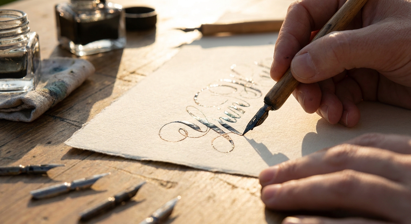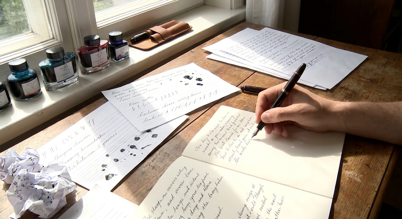
If you already love fountain pens and stationery, you are halfway to calligraphy. The controlled pressure, ink flow, and paper awareness you’ve cultivated for good handwriting are the same instincts that underpin beautiful script.
Why Calligraphy Belongs in Your Daily Writing
This guide is a practical roadmap: how to move from ordinary pen strokes to elegant, repeatable calligraphic forms—using tools you likely already own.
Step 1: Understand How Your Nib Shapes Your Letters
Before changing your handwriting, understand what your nib wants to do.
1.1 Analyze Your Current Pens
Gather your favorites, then on good paper write:
- Slow vertical lines
- Horizontal lines
- Diagonal lines (\ and /)
- Do verticals look thicker than horizontals? You may already have a stub or italic nib.
- Do lines get thicker when you press down? There is some flex or softness.
- Are all strokes the same width? You’re working with a round nib (fine/medium/broad).
- Stub/italic: Italic, Foundational, Gothicized scripts.
- Soft/flex: Copperplate, Spencerian, flourishing modern script.
- Round nib: Monoline lettering, simplified script, annotations around larger calligraphy.
Observe:
This tells you which style of calligraphy your pen will most naturally support:
1.2 Affordable Nib Upgrades
If your current nibs are all round:
- Swap in a 1.1–1.5 mm stub for Italic-inspired everyday writing.
- Try a calligraphy fountain pen set with multiple widths.
- For pointed pen styles, invest in a dip pen holder and a small selection of flexible nibs.
You don’t need to buy a grail pen to start; you need a nib that clearly differentiates thick and thin strokes.
Step 2: Match Your Ink to Your Script
The same ink looks completely different in a flex nib versus a broad italic. Instead of hoarding bottles, tune a few inks to specific uses.
2.1 Flow for Control vs. Drama
For beginners, aim for moderate flow and predictability.
- Italic calligraphy: A slightly drier ink keeps edges sharp and avoids puddling in slow strokes.
- Pointed pen / flex: A wet, lubricated ink helps maintain hairlines and prevents railroading (double lines when tines separate).
- Choose one well-behaved blue or black that works in most pens.
- Dedicate one slightly wetter ink to your flex or softer nib.
Practical approach:
2.2 Choosing Inks for Sheen and Shading
Use properties intentionally, not randomly.
For practice pages
- Prioritize legibility and flow over special effects.
- Neutral inks (blue-black, grey, brown) are easier on the eyes in long sessions.
- Shading inks highlight stroke contrast in Italic and broad-edge scripts.
- Sheening inks add drama on larger, slower strokes—ideal for display capitals.
- Consider water-resistant or pigmented inks, but use them in easily cleaned pens.
For titles, quotes, and envelopes
For sketchbooks and mixed media
2.3 Ink Safety and Maintenance
- Avoid permanent or heavily saturated inks in vintage or irreplaceable pens.
- If you insist on shimmering ink, dedicate a single easy-to-disassemble pen to it and flush often.
Step 3: Pick Paper That Lets Letters Breathe
Calligraphy rewards paper that respects your effort.
3.1 Practice Paper vs. Performance Paper
Practice paper should be:
- Smooth enough to avoid snagging.
- Heavy enough to resist bleed-through.
- Affordable enough that you’re not afraid to use it generously.
Examples: Rhodia pads, Clairefontaine notebooks, Japanese notebook papers, and layout paper for guideline tracing.
Performance paper is for final pieces:
- Heavier (often 100–200 gsm).
- Better sized, allowing crisp edges and potential sheen.
- Often available in single sheets or artist pads.
3.2 The Simple Test
On any new paper, write:
- A short word with slow, heavy strokes.
- A quick sentence at normal speed.
- Feathering: Fuzzy edges mean poor sizing or over-wet combination.
- Bleed-through: Limits use of duplex pages or dense work.
- Dry time: Long dry times can be beneficial for sheen, frustrating for left-handers or quick note-taking.
Check for:
Match paper to purpose; you don’t need museum-grade sheets for daily drills.
Step 4: Build a Calligraphy Routine with Tools You Love
Calligraphy thrives on repetition, but it needn’t feel like homework.
4.1 Warm-Up Rituals
Start each session with five minutes of tactile familiarization:
- 10–20 slow vertical strokes.
- 10–20 horizontal strokes.
- Curves (o-shapes, c-shapes) at consistent size.
- Is the nib catching? Check alignment or paper texture.
- Is ink too dry or wet? Adjust pen/ink pairings next time.
Use this time to notice:
4.2 Integrate Calligraphy into Real Writing
You’ll progress faster when calligraphy leaves the practice pad.
- Write journal headings in a different style each week.
- Address envelopes with an Italic or Copperplate-inspired hand.
- Copy short poems or quotes in your best script onto nicer paper.
Use your favorite pens for these, so the practice feels like a reward, not an obligation.
Step 5: Simple Maintenance That Protects Your Progress
A misbehaving pen can derail a practice streak. Basic care prevents most frustrations.
5.1 Regular Cleaning
- Flush every few weeks for regularly used pens.
- Always clean before storing a pen for a long break.
- If strokes become inconsistent, skipping, or pale, a simple flush often restores normal flow.
- Remove factories’ protective coating (often with a gentle wash and wipe or a brief dip in alcohol).
- Rinse often during sessions; dried ink on the nib ruins fine hairlines.
For dip nibs:
5.2 Light Tuning You Can Safely Attempt
- Micro-alignment: If a nib feels scratchy in only one direction, tines may be slightly misaligned. A jeweler’s loupe and careful fingertip adjustments can help.
- Ink choice as tuning: If a pen writes too dry but you’re hesitant to adjust the nib, move to a slightly wetter ink instead of forcing the hardware.
For anything more advanced (grinds, reshaping, heavy scratch removal), consider a professional nib specialist.
Step 6: Thoughtful Buying Across Budgets
Before adding more pens or inks, ask: What new capability am I buying? Not just a new color, but a new line quality or use-case.
6.1 Under $75: The Focused Starter Kit
Aim for:
- 1–2 fountain pens (one round, one stub or italic).
- 1 bottle of well-behaved dark ink + 1 shading ink.
- 1 reliable practice pad.
Skill goal: Master consistent letter height, spacing, and slant in one primary script.
6.2 $75–$200: Expanding Styles
Add:
- A flex-capable tool (entry-level flex fountain pen or dip pen setup).
- Higher-grade paper for finished work.
- Possibly a pen with a slightly wider nib for bold titles.
Skill goal: Distinguish between body text scripts (legible, moderate contrast) and display scripts (ornate, higher contrast and/or flourishing).
6.3 $200–$500: Personal Signature
Invest in:
- A custom nib grind tailored to your grip and preferred letterforms.
- A small curated ink palette chosen for both property and palette.
- Archival or artist-grade substrates for pieces you hope to keep or gift.
Skill goal: Develop a recognizable personal style—the subtle signature of your hand, not just the textbook ideal.
Step 7: Learning to See, Not Just Copy
Tools matter, but your eyes are your most powerful instruments.
7.1 Train Your Eye with Simple Comparisons
When you see calligraphy you admire, look closely and ask:
- Where are strokes thick vs. thin?
- How high are ascenders and descenders compared to x-height?
- Is the slant consistent throughout the word?
Then compare with your writing on similar paper with a similar nib. This simple analysis improves faster than blind repetition.
7.2 Keep a Calligraphy Log
In a dedicated notebook, record:
- Pen + nib size
- Ink name and color
- Paper used
- Date and practice focus (e.g., “Italic: n, m, h joins”)
Over time you’ll develop a personal reference library of combinations that sing—and those to avoid.
The Quiet Joy of a Deliberate Line
Calligraphy does not demand perfection. It invites deliberation: a small pause before you set nib to paper, the awareness of how your pen feels at those first millimeters of a downstroke, the tiny gleam of ink as it settles into its final hue.
For fountain pen enthusiasts, this is not a new world but a deepening of a familiar one. With each tuned nib, carefully chosen ink, and considered sheet of paper, you transform ordinary writing into a quiet daily luxury—a craft you carry in your hand.