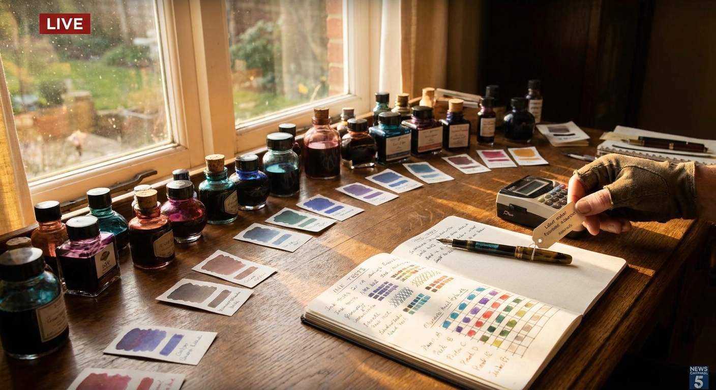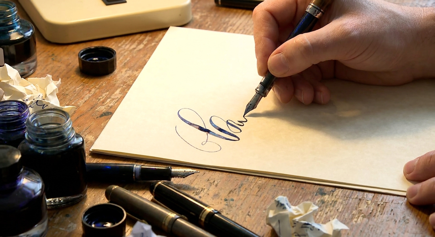
To the uninitiated, a bottle of fountain pen ink is a simple thing: colored fluid in a glass jar. To those of us who obsess over nibs, paper, and the slow curve of a handwritten line, ink is something closer to alchemy. It is the invisible engine that turns a well‑tuned pen into a living instrument.
The Quiet Drama Inside Your Converter
This guide explores the properties that make fountain pen inks so captivating: flow, sheen, shading, lubrication, and how they dance differently with every nib and page.
Ink as a Performance Partner, Not an Accessory
We often speak of buying “a pen and some ink,” as though the ink were a mere consumable. In practice, the ink changes how your pen behaves at every level:
- Flow determines how readily ink travels from feed to nib tip.
- Lubrication affects how smoothly the nib glides.
- Saturation shapes color richness and legibility.
- Drying time influences smudging and practicality.
- Sheen and shading add drama and dimension to each letter.
Think of ink as a performance partner: the same nib will feel expressive, dull, or temperamental depending on what it’s drinking.
Nib and Feed: The Gatekeepers of Ink Personality
Before you can appreciate ink characteristics, you need to understand how your nib and feed set the stage.
Nib Width and Grind
- Extra‑fine (EF) & fine (F)
- Favor clarity and control.
- Show less shading and sheen because less ink hits the page.
- Ideal for small handwriting, margins, and lower‑quality paper.
- Medium (M) & broad (B)
- Deposit more ink; shading and sheen become visible.
- Great for journaling and correspondence where character matters.
- Stub & italic
- Provide line variation and a calligraphic look.
- Show off multi‑tone inks spectacularly.
Wet vs. Dry Writers
- Wet pens lay down a generous line. Inks appear darker, smoother, and sheeny; dry times increase.
- Dry pens restrain flow. Inks appear lighter, with cleaner lines and faster drying.
Try the same ink in a wet broad and a dry fine: you will think you’re using two entirely different products.
Ink Properties: Decoding the Jargon
Flow and Lubrication
Flow is about how eagerly the ink reaches the nib; lubrication describes how silky it feels on paper.
- Highly lubricated inks (common in some Japanese and boutique brands) can make even toothy paper feel indulgent.
- Drier inks offer more control and crisper edges, particularly welcome in very wet pens.
- Wet pen + wet ink = lush but potentially smeary.
- Dry pen + dry ink = controlled but potentially scratchy.
- Aim for balance: wet with dry, or dry with wet, to hit a sweet spot.
Pairing tip:
Saturation, Shading, and Sheen
- Saturation: Heavily saturated inks are bold and high‑contrast. Less saturated inks can look vintage and soft.
- Shading: Variation in light and dark within a single stroke. Broad and stub nibs on good paper showcase this beautifully.
- Sheen: A reflective, often metallic color that appears where ink pools—emerald halos on a burgundy line, gold flashes on a navy word.
If you enjoy visual drama, look for inks marketed as shaders or sheeners and pair them with a wet nib and dense paper.
Water Resistance and Archival Concerns
- Standard dye inks: Gorgeous, easy to clean, but typically not waterproof.
- Iron gall and pigment inks: Offer more water resistance and permanence but require attentive maintenance.
For journaling you’ll revisit or documents you want to preserve, a well‑behaved iron gall or modern pigment ink on quality paper is worth considering.
Paper: The Third Member of the Trio
Paper decides how ink can reveal itself. Three key qualities matter:
- Sizing: Treated papers resist ink absorption, allowing shading and sheen to develop.
- Smoothness: Smooth sheets highlight lubricated inks and fine nibs.
- Weight and density: Heavier, denser papers better resist bleedthrough.
Paper Personalities
- Everyday office paper
- Often fibrous and poorly sized.
- Choose drier inks and fine nibs to reduce feathering and bleed.
- Fountain‑pen‑friendly notebooks
- Brands like Rhodia, Clairefontaine, and many Japanese notebooks shine.
- Sheen and shading come alive; even wet inks behave.
- Coated or very smooth papers
- Perfect for intricate sheening inks.
- Expect longer drying times; blotting paper becomes your friend.
Maintenance: Keeping the Magic Clean
Inks are gentle, but neglect is not. Good ink hygiene protects both pen and page.
Routine Care
- Flush between ink changes: A bulb syringe and lukewarm water are usually enough.
- Avoid permanent/pigment inks in rarely used pens: These prefer regular movement.
- Use pen flush periodically: Especially after strongly saturated or shimmering inks.
Recognizing Trouble
- Hard starts and skipping may indicate dried ink in the feed.
- Color shifts can signal contamination from leftover ink in the pen.
A simple rinse cures most ills. Reserve nib disassembly for pens designed to be taken apart—or for a professional.
Tuning Ink to Your Hand
The most satisfying writing setup is personal: it reflects your pressure, speed, and letterforms.
- Light pressure, slow writing
- A wetter ink and softer nib will reward your gentleness with luscious lines.
- Firm pressure, quick notes
- A drier, faster‑drying ink in a fine nib prevents smudges and over‑broad strokes.
Try keeping a small log:
- Pen + nib size
- Ink name
- Paper used
- Notes on feel, drying time, and appearance
Patterns will emerge: your hand will quietly tell you what it likes.
Buying Ink Across Budgets
The ink world ranges from modest, workhorse bottles to artisanal limited editions. You don’t need to spend much to write beautifully.
Under $15: Reliable Workhorses
- Who it suits: Students, office writers, newcomers.
- Look for:
- Good flow and easy cleaning.
- Conservative colors suitable for professional settings.
- Value tip: Many major manufacturers offer 50–80 ml bottles that last for ages.
$15–$30: Character and Variety
- Who it suits: Journaling enthusiasts, letter writers, ink experimenters.
- What you gain:
- Distinctive hues, better shading, and curated collections.
- Regional and boutique makers with strong personalities.
$30 and Up: Boutique and Collectible
- Who it suits: Color connoisseurs and collectors.
- Expect:
- Elaborate bottles and packaging.
- Complex colors, strong sheen, or unusual properties.
Before indulging in a full bottle, consider ink sample vials. They let you test performance in multiple pens and on your favorite paper without committing.
The Pleasure of a Well‑Matched Trio
When pen, ink, and paper harmonize, writing stops feeling like a task and becomes a sensory ritual: the weight of the barrel balanced in your fingers, the whisper of the nib on paper, and a line that glows with precisely the character you imagined.
Explore slowly. Change one variable at a time. Learn how a sober blue‑black behaves in your daily writer versus how a shimmering violet flambés across your journal. With each experiment, your understanding deepens—and so does your pleasure every time you uncap a pen.
Inks are not just colored fluids. They are the moods, voices, and textures of your handwriting. Treat them as co‑authors, and they will reward every page you give them.