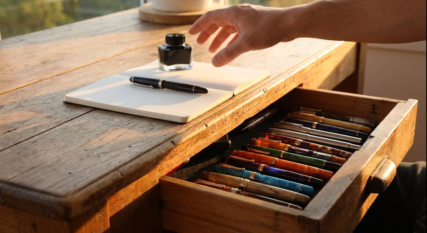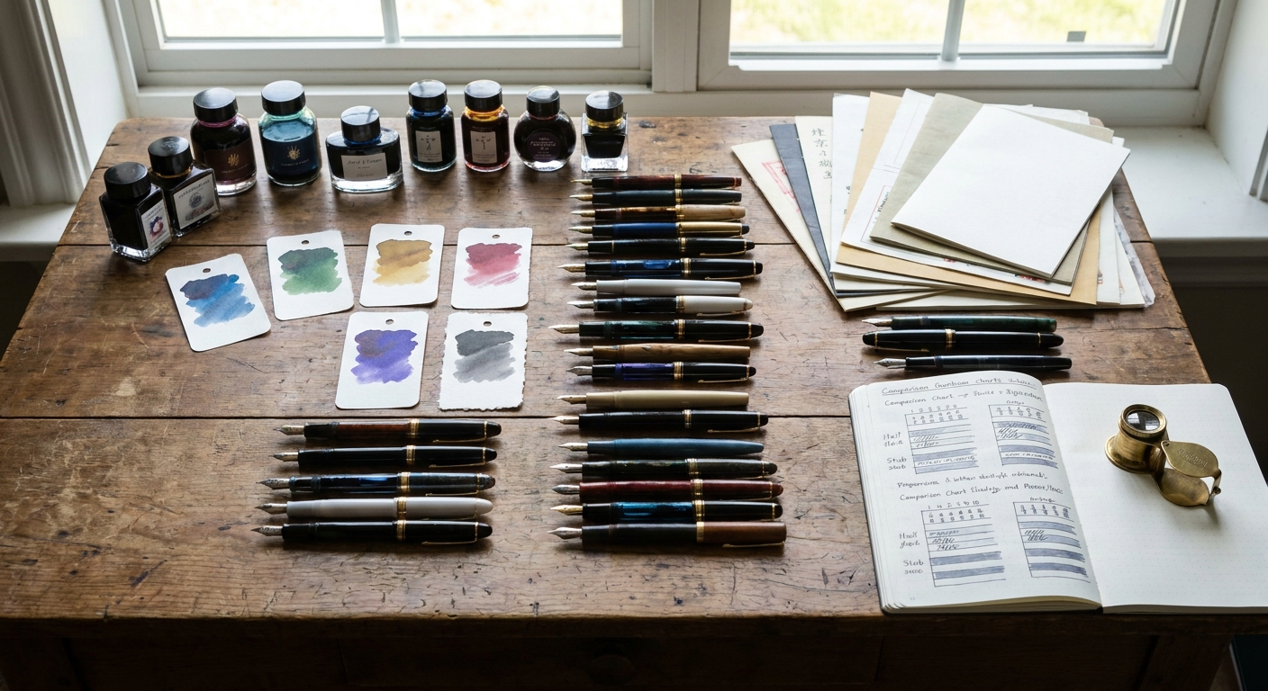
Most reviews isolate a single object: a pen, an ink, or a notebook. Yet writing is a system—pen, nib, ink, and paper form a quartet. Change one instrument and the entire performance shifts.
Introduction: Beyond Standalone Reviews
This article offers a comparative review framework for fountain pen and stationery lovers who want to go deeper. Rather than telling you which products to buy this month, we’ll explore how to evaluate combinations: how a crisp steel fine behaves with a shimmering ink on toothy paper, why a gold medium can transform a muted blue‑black, and how thoughtfully chosen tools can elevate the simple act of writing a date at the top of a page.
Part I: The Pen — Translating Motion Into Line
1. Material and Build: The Tactile Prelude
The first notes of any writing session are tactile: the weight in your fingers, the click of the cap, the feel of the section.
When you evaluate or read reviews, look for these specifics:
- Material: Acrylic and resin are warm and often lightweight; brass and stainless steel carry gravitas but can fatigue the hand. Ebonite warms gently and offers a subtle grip.
- Surface texture: Polished finishes glide in the hand; matte or lightly blasted finishes offer confidence to those with naturally dry fingertips.
- Section geometry: Tapered, straight, or sculpted. Long, gently tapered sections suit most grips; short, abrupt sections can force the fingers into the threads.
A good review notes where the fingers actually rest. Threads that look sharp in photos may be completely out of the way in use—or vice versa.
2. Nib Behavior: Precision, Expression, and Feedback
A nib review should always include three anchors: line width, wetness, and feedback.
- Line width: Compare across brands. A Japanese Fine is often closer to a Western Extra‑Fine. A German Broad can border on a stub.
- Wetness: On a 1–5 scale, a “3” is pleasant for most tasks. 1–2 suits absorbent paper and fast notes; 4–5 turns shading and sheen into spectacle on quality paper.
- Feedback: Distinguish between tooth (pleasant tactile presence) and scratch (catching, misaligned tines).
Specialty nibs deserve particular scrutiny:
- Stub and italic nibs produce line variation without flex. In reviews, look for corner rounding—too sharp and they dig; too rounded and they lose character.
- Soft or semi‑flex nibs should be tested for controlled line variation at realistic writing speed, not just dramatic pressure shots.
When you conduct your own comparisons, write the same word—say, “Autumn”—with each nib on identical paper. The way the downstrokes and crossbars render will tell you more than any abstract description.
Part II: The Ink — Color as Mood and Mechanism
1. Flow, Lubrication, and Cleaning
Ink is both pigment and lubricant. A good review considers:
- Flow: Does the ink start instantly after a pause, or does it need coaxing?
- Lubrication: Does it make even a toothy nib feel smoother, or does it reveal every flaw?
- Cleanability: How many flushes until water runs clear? Saturated, sheening inks and some permanent formulations cling more stubbornly.
A practical comparative test:
- Use a moderately wet medium nib.
- Fill with three inks: a well‑behaved office blue, a saturated sheener, and a permanent or iron‑gall ink.
- Note starting reliability after overnight rest, then flush each and count fills of water needed.
This small experiment will teach you to read ink reviews with a sharper eye.
2. Sheen, Shading, and Subtlety
On the page, ink behavior becomes a form of choreography.
- Sheen: A high‑sheen ink may appear almost black in heavy strokes but explode into red or gold at the edge of a loop. On absorbent paper, that drama disappears.
- Shading: Inks like dusty olives, muted browns, and certain grays can create a watercolor effect in every word, especially in wider nibs.
- Subtlety: Not every ink needs to shout. A soft blue‑gray or charcoal with low sheen can be easier on the eyes for pages of notes or diaries.
Thoughtful guides compare how an ink behaves in at least two nib widths and on two paper types. A classic exercise: write the same sentence with a Fine on copy paper and a Broad on premium Japanese paper. You will see different personalities emerge from the same bottle.
Part III: The Paper — The Stage That Makes or Breaks the Show
1. Surface and Absorption
Paper reviews should isolate two variables: how ink sits on the surface, and how quickly it sinks in.
- Slick, coated papers (e.g., Tomoe River) maximize sheen and shading but can smudge if you turn pages too quickly.
- Lightly toothy papers (e.g., Midori MD, many quality European papers) balance control with character.
- Absorbent office papers sacrifice sheen for speed; they’re practical, but require careful pairing with finer nibs and drier inks.
When reading comparisons, take note of:
- Dry times reported with specific nib/ink combos.
- Whether feathering appears only under a loupe or is obvious at a glance.
- How the paper behaves with wet flex writing versus quick ballpoint‑style strokes.
2. Format and Binding
The form of the paper affects how often you use it:
- Stitched notebooks lie flatter and feel more intentional for journaling.
- Spiral or disc‑bound options excel for reference notes and revision.
- Loose sheets and pads invite letter‑writing and leisurely drafts.
A refined review discusses whether the notebook stays flat without coercion, how the spine behaves at the center spread, and whether tear‑out pages leave clean edges.
Part IV: Comparative Combinations — Three Case Studies
Let’s apply this framework using three archetypal combinations you can replicate or adapt.
Case 1: The Everyday Analyst
- Pen & nib: Lightweight steel‑nibbed pen, Japanese Fine.
- Ink: Conservative blue‑black with moderate dryness.
- Paper: 80–90 gsm, smoother‑than‑average office notebook.
Behavior:
- Crisp, narrow lines with minimal feathering.
- Fast dry times, minimal smearing when pages rub in a bag.
- Feedback is present but controlled—excellent for margin notes and annotations.
Ideal for: Students, editors, and anyone writing on unpredictable office paper. Reviews of this setup should emphasize legibility, ghosting levels, and comfort over long sessions.
Case 2: The Evening Letter Writer
- Pen & nib: Resin pen with a gold Medium or Soft Fine.
- Ink: Shading sepia or muted teal.
- Paper: Premium letter paper or mid‑weight Japanese notebook.
Behavior:
- A gentle bounce from the nib, with subtle line variation in downstrokes.
- Ink pools slightly at stroke ends, creating halos of darker color.
- Dry times are moderate; letters reward unhurried writing.
Ideal for: Journaling, correspondence, and personal projects where the process is as important as the result.
Reviews of this combination should dwell on feel: how the pen responds to cursive loops, how the ink colors the emotional tone of the page.
Case 3: The Showcase Sheen Enthusiast
- Pen & nib: Wet steel Broad or stub.
- Ink: High‑sheen blue or green with red sheen; optionally, a shimmer.
- Paper: Coated, low‑absorption paper (Tomoe River, Cosmo Air Light).
Behavior:
- Lines glisten as they dry, with borders in contrasting metallic tones.
- Smudging is a risk if pages are turned too quickly.
- Slight ghosting or show‑through is common but tolerable in single‑sided use.
Ideal for: Title pages, quote collections, and ink swatch journals.
A good comparison here discusses trade‑offs: spectacular visuals versus practical usability, drying time, and potential for smearing on the opposite page.
Part V: Maintenance and Tuning in a Comparative Context
1. Cleaning Between Trials
Comparative reviews demand consistent baselines.
- Use distilled water for flushing between inks when possible.
- For stubborn sheening or permanent inks, a mild pen flush restores neutral behavior.
- Avoid testing a notoriously dry ink immediately after a saturated lubricated one without full cleaning; remnants can mislead your impressions.
2. Simple Tuning for Reliable Comparisons
Before you judge a pen harshly:
- Check for baby’s bottom (overly rounded tipping causing hard starts). A loupe or high‑resolution photo can help.
- Verify tine alignment under light—reflections should be symmetrical.
- Write slow horizontal and vertical lines. Persistent railroading or skipping in only one direction often signals misalignment.
Enthusiast reviews that disclose basic tuning actions—“a slight tine alignment corrected skipping”—are more trustworthy than those declaring a pen faulty without examination.
Part VI: Budget‑Conscious Comparative Buying
1. Under $50: Building a Reference Set
At this level, focus on variety:
- Two pens with different nib widths (e.g., Fine and Broad).
- Three inks: a workplace blue‑black, a shading color, and a saturated jewel tone.
- A decent notebook and a ream of higher‑quality printer paper.
This modest arsenal allows meaningful comparisons across many future acquisitions. Each new ink or pen can be evaluated against a known baseline.
2. $50–$150: Refining Taste With Purpose
Invest in:
- One pen with an interchangeable nib unit.
- A gold‑nibbed pen if curiosity about feel is persistent.
- Two contrasting papers: one sheen‑friendly, one workhorse.
Rather than buying three mid‑tier pens on impulse, purchase one thoughtfully chosen model and explore different nib units and inks. This approach expands experience without bloating the collection.
3. Above $150: Curating Experiences, Not Just Objects
At higher budgets, the question becomes: What experience is missing from my current quartet?
- A soft, expressive nib for letters?
- A pocketable workhorse that can live clipped to a notebook?
- An heirloom piece that marks a personal milestone?
Let comparisons guide you. If your favorite affordable steel pen already provides a perfect writing experience, perhaps your money is better spent on exquisite paper or a small suite of distinctive inks.
Conclusion: Learning to Hear the Quartet
The pleasure of writing by hand lies not in isolated superlatives—“buttery nib,” “insane sheen,” “ghosting‑free paper”—but in harmony. A slightly toothy paper can tame an exuberant nib. A well‑behaved ink can render a temperamental flex pen trustworthy. A humble steel fine nib can sing when paired with the right notebook.
By adopting a comparative mindset—evaluating pens, inks, and papers in concert—you not only become a more discerning reader of reviews, but a more satisfied writer. The goal is not the largest collection, but the most resonant combinations: tools that turn even a shopping list, a margin note, or a dated journal entry into a small, private luxury.
The next time you ink a pen, think of it as tuning an instrument for a performance only you will fully witness. With attentive reviews and thoughtful guides, every stroke can feel like a well‑rehearsed, deeply personal piece of music.