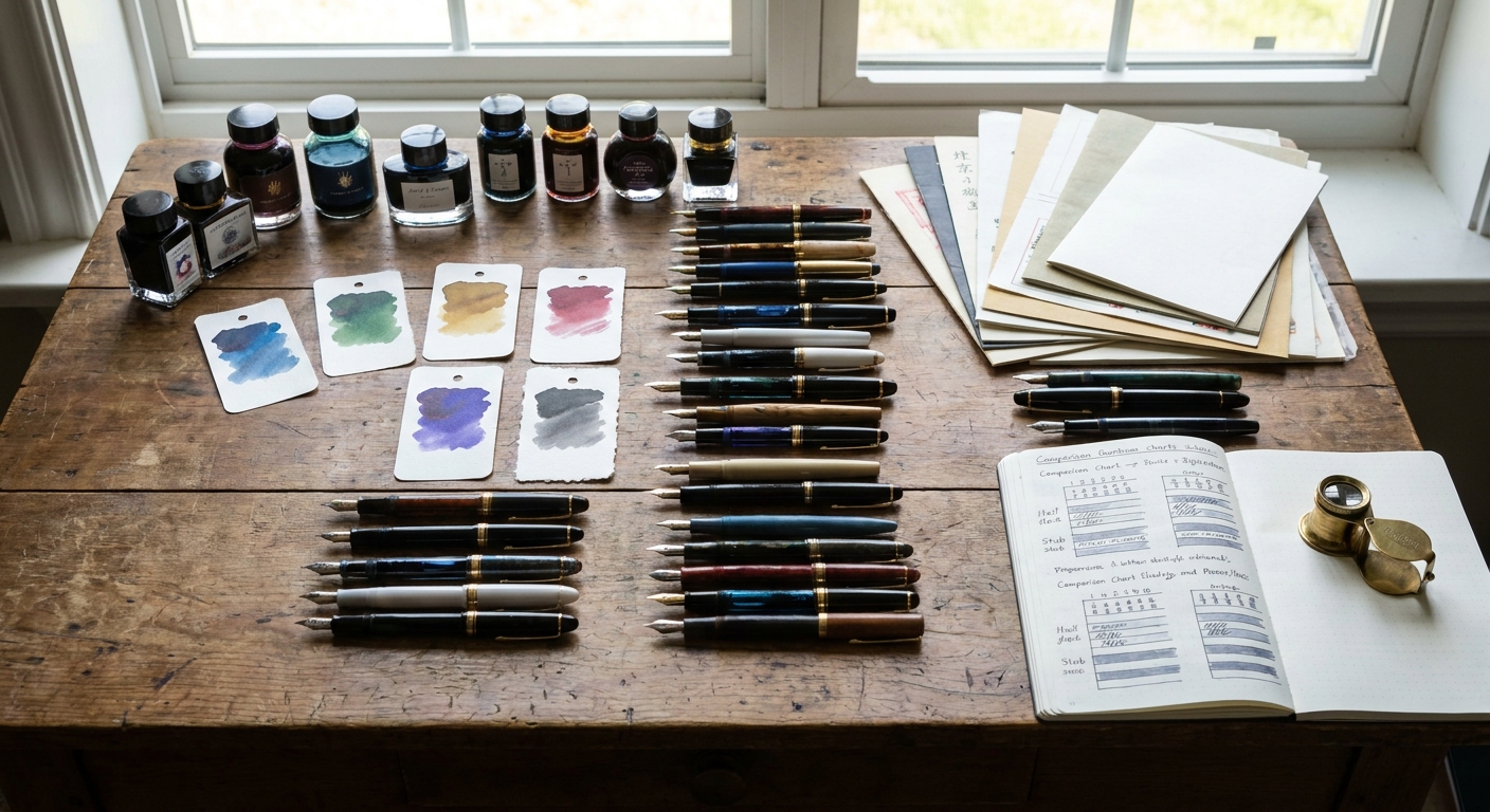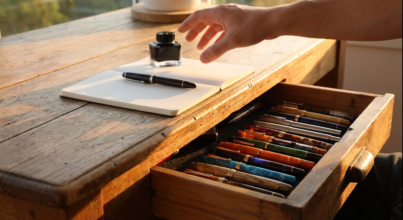
If you are reading this, you likely own at least one fountain pen that lives more in a drawer than in your hand. This guide is about preventing that from happening again. Rather than chasing specifications for their own sake, we’ll look at how to assess pens, nibs, inks, and paper with one clear goal: choosing a fountain pen that delights you every time you uncap it.
Introduction: Choosing a Pen You’ll Actually Use
Step 1: Start With How You Write, Not What Others Love
Before comparing brands and models, examine your own writing habits:
- Session length: Are you a quick note‑taker or a long‑form journaler?
- Grip and pressure: Do you write lightly or press down hard from ballpoint habit?
- Letter size: Large round script or compact, tight lettering?
- Environment: Office forms, classroom notes, or a quiet desk at home?
These details will influence everything: weight, nib width, ink wetness, and even paper choice.
Understanding Pen & Nib Characteristics
Weight, Balance, and Section Shape
A refined daily writer should disappear in the hand.
- Weight: 18–28 g (inked) is a sweet spot for most. Heavier metal pens can fatigue the hand during long sessions.
- Balance: Try writing with and without the cap posted. A back‑weighted pen tires the hand; a neutral balance encourages relaxed motion.
- Section shape: A gently tapered, slightly girthy section (about 10–11 mm) tends to suit most grips. Very thin sections can cause hand cramps, especially for former gel‑pen users.
Nib Size and Personality
Nib choice is where writing character truly begins.
- Extra‑Fine (EF): Ideal for small handwriting, marginal notes, and cheap office paper. Often less smooth but highly controlled.
- Fine (F): A versatile choice for mixed use, especially in Asian and European brands where fines differ.
- Medium (M): Comfortable, smooth, and expressive—excellent for journaling and letters.
- Broad (B) & Stubs: For shading inks, signatures, and decorative notes; best on good paper.
Within these sizes, each brand has a “house style.” A Japanese Fine often writes closer to a Western Extra‑Fine, while many German Mediums feel generously broad.
Steel vs. Gold vs. Specialty Nibs
- Steel nibs: Modern steel nibs are superb. They offer consistency, resilience, and attractive pricing. Most newcomers and many veterans could happily stop here.
- Gold nibs: More about feel than status. Often softer and more forgiving, with a cushioned, springy feedback. They can offer subtle line variation and increased ink flow.
- Specialty nibs: Architects, cursive italics, and fude nibs reward experimentation. They add character but also demand matching paper and practice.
When reading or watching reviews, look for concrete descriptors: “soft bounce with audible feedback,” “glass‑smooth but slightly dry,” “controlled, not a gusher.” Avoid reviews that only say “writes great” without explaining how.
Ink Properties: Flow, Sheen, and Shading
Ink is not mere fuel; it is the voice of your pen.
Flow and Lubrication
- Dry inks (e.g., many iron gall or permanent formulas) tame wet nibs and make cheap paper more usable.
- Wet inks feel luxurious—gliding across the page—but can feather on poor paper and take longer to dry.
Match extremes against each other: a dry ink in a wet nib, or a lubricated, wet ink in a stingy, dry nib.
Sheen, Shading, and Saturation
- Sheen: A metallic, angled color shift (e.g., teal ink with red sheen). Requires non‑absorbent paper. Mesmerizing in broad nibs; almost invisible in extra‑fines.
- Shading: Variation between light and dark within each stroke. Shows best in medium and broader nibs on quality paper.
- Saturation: Intensity of color. Highly saturated inks look dramatic but may stain converters; gentler inks can feel more understated and elegant.
A considered collection might be:
- A conservative blue‑black or gray‑black for work.
- A shading medium‑tone ink (olive, teal, or sepia) for journaling.
- A high‑sheen or shimmering ink reserved for greeting cards and letters.
Paper Compatibility: Where Reviews Really Matter
Even the finest nib and ink combination is at the mercy of paper.
Three Paper Behaviors to Watch
- Feathering: Lines spread into the fibers, losing crispness.
- Bleedthrough: Ink soaks completely through, unusable on the back.
- Ghosting (Show‑through): Visible on the back but not fully bled; sometimes acceptable.
In reviews, look for comments like “handles saturated inks with minimal feathering” or “excellent but too slick for quick note‑taking.”
Choosing the Right Paper for the Right Task
- Everyday notebooks (budget): Look for 80–90 gsm with fountain‑pen friendliness mentioned explicitly. Many house‑brand or office notebooks still fail here.
- Premium writing paper: Tomoe River, Cosmo Air Light, Midori MD, and other Japanese papers specialize in sheen and shading, though dry times can be longer.
- Work and study: Slightly toothy papers are easier to control for fast notes, especially with fine nibs.
A truly useful review will test multiple inks and nib sizes on the same paper and show writing samples, not just a single line.
Maintenance and Tuning: Turning a Good Pen Into a Great One
Basic Care Routine
- Flush regularly: For pens in steady rotation, a water flush every 1–2 fills prevents clogging.
- Use pen flush when needed: Especially after pigmented, shimmering, or iron gall inks.
- Cap promptly: Many nib complaints come from simple evaporation.
Simple Tuning You Can Confidently Attempt
- Flow adjustment: Gently spreading or narrowing tines (with proper guidance) can fix overly dry or gushing pens.
- Nib smoothing: Micromesh and mylar can correct scratchiness, but work slowly and test often.
Many otherwise lukewarm reviews would have been glowing if the nib had been properly cleaned and lightly tuned. When reading guides, appreciate authors who disclose whether a pen is reviewed “as received” or after tuning.
Buying Guidance Across Budgets
Under $30: Smart Starters
Look for:
- Reliable steel nibs with minimal QC issues.
- Cartridge/converter systems, not proprietary cartridges only.
- Comfort-focused sections, not fashion‑first designs.
Expectations: These should be workhorses. Don’t chase exotic nibs yet; chase reliability.
$30–$100: Character and Choice
This is where you refine preferences.
- Explore different nib widths and body materials (acrylic, resin, light metal).
- Consider a dedicated “sheen pen” with a wetter nib.
- Choose at least one pen purely because you love how it looks—aesthetics matter in daily joy.
$100–$300: Feel and Finesse
- Start exploring gold nibs and boutique makers.
- Pay attention to balance, posting options, and section comfort—small differences become noticeable.
- Seek pens with easily swappable nib units so you can experiment without buying a full pen each time.
$300 and Beyond: Intentional Indulgence
At this point, you are no longer buying function; you are curating experience.
Ask yourself:
- Will this fill a real gap (flex, specialty nib, travel pen, or heirloom piece)?
- Will I enjoy writing with this for more than the first week after unboxing?
Read long‑term reviews, not launch‑day impressions. Look for commentary about how the pen ages: plating durability, cap seals, and long‑session comfort.
How to Read (and Trust) Reviews
A refined buyer reads between the lines.
Signs of a Thoughtful Review
- Clear description of nib size and writing pressure.
- Multiple ink and paper combinations tested.
- Acknowledgment of sample size: one pen vs. several.
- Photos or scans that are not heavily filtered.
Red Flags
- Vague praise: “Smooth! Great!” with no comparison.
- No mention of paper, ink, or nib width.
- Overemphasis on packaging and unboxing.
Seek reviewers whose handwriting style and preferences resemble your own. Their favorites are more likely to become yours.
Conclusion: Building a Writing Life, Not Just a Collection
The most successful fountain pen purchase is not the most expensive or the most hyped; it is the one you reach for without thinking when you have something important—or intimate—to put on paper.
Use reviews and guides as lanterns, not commandments. Pay attention to how people describe feel, flow, and paper compatibility, and then connect those details back to your own habits.
In the end, the goal is simple and deeply satisfying: a pen that hums across the page in your hand, an ink that reflects your mood, and paper that captures it all with grace. Everything else is commentary—and perhaps, a gentle excuse to ink up one more pen.