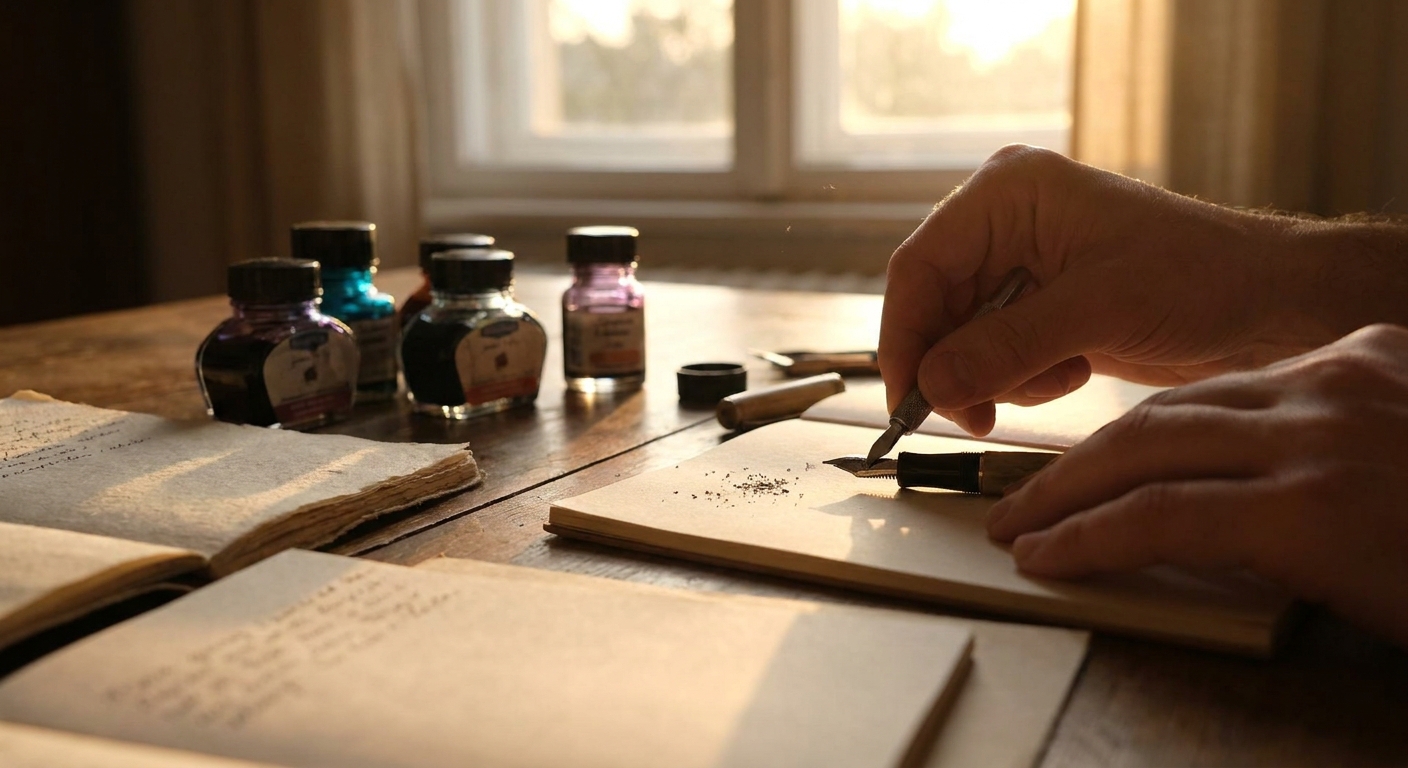
Most of us buy pens for how they look and only later discover how they behave on paper. Yet the true character of a nib only appears in dialogue with ink and paper. A nib that feels toothy on copier paper may glide like velvet on a good journal; a legendary sheening ink may look flat on a cheap pad.
Why Tuning Starts with Your Notebook
This playbook approaches nibs and tuning from a different angle: start with how and where you write, then shape your pen choices and adjustments around that reality.
Step 1: Define Your Writing Habitat
Before you reach for micro‑mesh, pause and observe.
Ask yourself:
- Where do you write most? At a desk, in a lecture hall, on trains, in bed?
- What paper do you use daily? Office copy, planners, premium journals, letters?
- What is your handwriting like? Large and looping, or small and compact?
- What do you value more? Precision, expressiveness, or visual drama (sheen, shading)?
These answers set the constraints for nib character, ink properties, and how far you can push tuning before practicality suffers.
Step 2: Matching Nib to Paper, Not the Other Way Around
1. The Office Warrior Setup
Paper: Copier, printer forms, meeting handouts—thin, absorbent, prone to feathering.
You need:
- Nib: Fine or extra fine, relatively firm.
- Flow: Slightly on the dry side to prevent bleed‑through.
- Ink: Well‑behaved, low feathering, quick‑dry.
- Aim for controlled smoothness: no drag, but not a paintbrush.
- Keep the tines aligned and the slit modest. Over‑widening will cause messy pages.
Tuning focus:
Ideal candidates: Japanese fine nibs, steel fines with conservative feeds, and inks marketed as “office friendly” or “document safe.”
2. The Journal Companion
Paper: Leuchtturm, Midori, Rhodia, or similar mid‑to‑high quality notebooks.
You can enjoy:
- Nib: Fine to broad; even stubs for headings.
- Flow: Moderate to wet for shading and character.
- Ink: Characterful hues with shading or subtle sheen.
- Prioritize pleasant feedback: a hint of tooth can be welcome, like the grain in good drawing paper.
- Wetness should stop just short of show‑through on your chosen notebook.
Tuning focus:
Mix one "workhorse" nib (fine or medium) with one expressive nib (stub or generous medium) and tune both explicitly around your journal paper.
3. The Letter & Calligraphy Set
Paper: Smooth, heavier stationery; envelopes and cards.
You’re free to explore:
- Nib: Broad nibs, stubs, italics, flex.
- Flow: Moderately wet, even generous.
- Ink: High shading, sheening, or water‑resistant blues and blacks for archival letters.
- Flow consistency is vital; letters must not rail‑road or dry mid‑sentence.
- Smoothing should preserve edge in italic and stub grinds—you want line variation, not a ballpoint.
Tuning focus:
This is where a professionally tuned nib can shine; the cost is easier to justify for pens dedicated to meaningful correspondence.
Step 3: Reading Your Nib’s Behavior
Before adjusting anything, learn to diagnose by feel and sight.
Common Symptoms and Likely Causes
- Scratchy in one direction only – Tine misalignment or over‑polishing in a specific angle.
- Skips at the start of words – Slightly dry flow, contaminated feed, or ink too dry for this pen.
- Railroading with flex or broad nibs – Flow insufficient for pressure used or ink too dry.
- Ink gushes and spreads – Tines opened too wide, very wet ink, or paper too absorbent.
Try the simple fixes first: new ink, different paper, thorough cleaning. Only then should you consider mechanical tuning.
Step 4: Safe Tuning Techniques for Enthusiasts
Think of tuning as a continuum: some tasks are safe for careful hobbyists; others belong to experienced nibmeisters.
What You Can Safely Do
Cleaning & Flushing
- Flush with clean water whenever changing inks, especially from dark or shimmering colors to lighter tones. - For stubborn clogs, a small amount of pen‑flush or diluted dish soap (followed by extensive rinsing) helps.
Tine Alignment
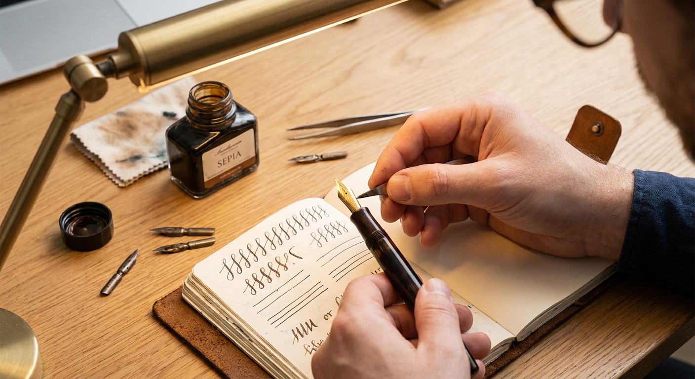
- Use a 10× loupe. - Hold the nib directly facing you; both tines should meet symmetrically. - Gently nudge the higher tine with your thumb or a fingernail and re‑check. Micro‑movements only.
Clearing the Slit & Micro‑Flow Increase
- Slide a brass shim between the tines from breather hole toward tip, once or twice. - This dislodges fibers and can marginally increase flow.
Minimal Smoothing for Occasional Feedback
- Ink the pen; write a word or two on normal paper and note exactly when you feel roughness. - On very fine mylar (or 12,000 micro‑mesh), write tiny figure‑eights using normal writing pressure for two seconds. - Test again on paper. Stop as soon as the sensation improves.
What You Should Leave to Professionals
- Aggressive smoothing or reshaping tipping
- Cutting or significantly widening the tines
- Converting standard nibs into stubs, italics, or architects
- Correcting sprung tines or bent gold nibs
It’s easy to remove metal; impossible to put it back. When in doubt, pay a nibmeister once instead of buying a replacement nib twice.
Step 5: Ink Selection as Tuning Without Tools
Ink choice is the gentlest, most reversible form of tuning.
To Increase Perceived Smoothness
- Choose lubricated or known "wet" inks.
- Slightly increase nib wetness via brass shim only if needed.
- On smoother paper (Rhodia, Clairefontaine), the combo will feel almost glassy.
To Tighten Lines and Boost Control
- Switch to a drier ink, often traditional business blues and blue‑blacks.
- Pair with more absorbent paper (but not the scratchiest stock you own).
For Maximum Sheen & Shading
- Use a moderately to very wet nib.
- Work on coated papers such as Tomoe River, Cosmo Air Light, or high‑grade letter paper.
- Accept longer dry times as part of the ritual: a small pause to admire the page becomes part of the pleasure.
The same nib that feels like a race car on Tomoe River can feel entirely different on a planner insert. You are not stuck with a single personality.
Step 6: Building a Purpose‑Built, Tuned Rotation
Rather than seeking "one nib to rule them all," assemble a small, coherent rotation tuned around tasks and paper.
A Sample Three‑Pen Rotation
The Daily Notetaker
- Nib: Fine steel - Tune: Slightly on the dry side, perfectly aligned - Ink: Conservative blue‑black or black with good behavior - Paper: Office, class notes, quick jottings
The Journal Storyteller
- Nib: Medium or 0.6–0.8 mm stub - Tune: Moderately wet, smooth with a whisper of feedback - Ink: Shading or gentle sheening colors - Paper: Dedicated journal on quality paper
The Letter Writer
- Nib: Broad, soft medium, or cursive italic - Tune: Juicy yet controlled, ink flow designed for longer text - Ink: Rich, emotionally resonant tones and archival options for special letters - Paper: Stationery, cards, high‑end pads
Each pen is tuned not in isolation, but as part of a system: nib, ink, paper, and purpose.
Maintenance Rhythms that Preserve Your Tuning
Careful tuning is wasted if maintenance is neglected. Establish simple, repeatable habits:
- Weekly (for heavily used pens):
- Wipe the nib and section with a soft cloth to remove ink crust.
- Monthly:
- Fully flush frequently used pens, especially those with saturated or shimmering inks.
- When changing inks:
- Flush until water runs clear; test flow with water before re‑inking.
Treat each cleaning as a quick check‑up: confirm alignment, note any changes in feel, and address small issues before they become large repairs.
Buying Guidance: Where to Spend and Where to Experiment
Budget Considerations
Entry Level (Under $50)
- Target brands known for consistent steel nibs.
- Prefer pens with easily swappable nib units; they invite experimentation.
- This is your playground for alignment practice and gentle smoothing.
- Look for pens with comfortable sections and reliable feeds.
- If you write long sessions, prioritize ergonomics over decoration.
- Consider dedicating a portion of the pen’s budget (say $30–$60) for professional nib tuning or grinding.
- Buy from vendors who inspect nibs before shipping or offer nib tuning as a service.
- For limited editions and vintage rarities, avoid DIY grinding; professional intervention preserves long‑term value.
Mid‑Tier ($50–$200)
Premium & Boutique ($200+)
Choosing Nibs with Tuning in Mind
- If you enjoy tinkering: durable steel nibs are forgiving practice grounds.
- If you value perfection out of the box: Japanese gold nibs and reputable European makers with strong QC are worth the premium.
- If you love line variation: budget for a custom grind early; few stock italic or architect nibs are truly optimized for your hand without some adjustment.
The Pleasure in a Pen that Fits Your Life
Well‑tuned nibs don’t demand that you change your writing habits; they quietly support them. A slightly dry fine taking fast meeting notes; a lush stub pouring shading onto evening journal pages; a broad, soft nib making every letter feel deliberate and ceremonial.
Tuning is not about chasing perfection in the abstract. It’s about shaping a small set of tools so that, whenever you reach for a pen, the experience is predictably delightful. Pen, ink, and paper become a single, cooperative instrument tuned to your own daily symphony of words.
In that alignment—of metal, pigment, fiber, and intent—the simple act of writing by hand becomes a tactile, enduring pleasure.